To begin, I would like to quote Tim Brown, the CEO of the innovation and design firm IDEO on his thoughts on design. “Design is not just about creating elegant objects or beautifying the world around us. The best designers match necessity to utility, constraint to possibility, and need to demand.”
In short—Design solves problems.
Lately there has been a trend into flat interface styles, but this is not a trend. This is a solution to a problem of inauthentic design.
I would like to take you all on a journey through a visual timeline of design innovation. First we will go back into history and understand the early design trends that accumulated into a problem of visual excess and how this brings about a desire for a greater authenticity in design, and finally the solution to creating this authentic design in a digital world.
What is authentic design?
I’ve said these buzz words a lot in my introduction, but they don’t really say much about what authentic means in the context. Authentic means not fake. Therefore authentic design is not trying to fake itself into being something else, it is based on the content. It is not trying to hide its function, or lack thereof, by unnecessary decoration. It is simple, clean, and functional.
I just want to take this time to echo the concept: Form follows function. An idea thought up by the “father of skyscrapers” Louis Sullivan. It boils down to the idea you must first think what you want to accomplish, and the design will come naturally. The form that follows function will always be inherently beautiful.
Now that we have the basis for what is authentic design let’s move on to…
When did design stop being authentic?
Technology. A lot of things changed because of technology, and one of these was making it easier to overdo things; everything, from architecture to furniture to fabric, was covered in ornamental designs. Similar to the renaissance, was all that necessary? Probably not, but technological advances made it possible.

An example of excess ornamental style, popular during the Renaissance.
Going back to Louis Sullivan, he called for restraint by suggesting, “It would be greatly for our aesthetic good, if we should refrain entirely from the use of ornament for a period of years.”
Technology may have created the problem, but embracing it is the solution.
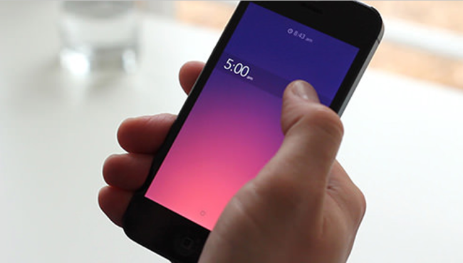
Design in general follows various trends, but the one I am introducing today – the trend towards more authentic design is most prominent in digital means. You all know what I’m talking about, the switch Apple made to iOS7. Or if you’re a Windows fan, the Windows8 system. If you’re not familiar with these interfaces, you’ve probably heard somebody complain at least once.
This early interface design principal can be summed up into one word: skeuomorphism. It is simplified into design that mimics objects in the physical world.

An example of skeuomorphism with calculators.
The desktop looks like a desktop, the notepad looks like a notepad, and the calculator looks like a calculator etc. This worked great when technology was just starting out because it made digital elements look familiar to the user. But does anybody even have a floppy disk anymore?
Windows8 is an example of authentic design, because it doesn’t look like the ancient desktop anymore. It relies on typography, spacing, and colour to communicate its content. There’s no extra decoration, just purely function.
Apple with iOS7 did just that, looking at the old interface and the new one on the iPhone, we can see it’s moving away from excess and mimicking physical objects. The icons no longer look like buttons, but why should they? It’s a touch screen. The limitation of having buttons was only for older phones, the touch screen doesn’t function like regular buttons so why should it look like them?
Authentic design is forward, it is moving away from old designs that came about from technological constraints and without those constraints digital content can fully be expressed by its functions into new and exciting forms, and with that comes beauty.
Authentic design in the digital sense does three things.
- Embraces the digital look
- No skeuomorphism
- Make the style content-centered. Function turns into form.
Design solves problems, but without technological constraints the problem is not its limitations but excess opportunities, in doing so it calls for a need of authentic design. The trend is here to stay.


